In 2021, we are stuck at home due to the pandemic, and businesses are trying to adapt to the situation by trying to operate in a digital space. Business websites are one of the most popular ways to showcase your product or service to customers.
When Google announced that responsive websites will see a boost in their search engine ranking in 2015, ever since then, businesses have made responsive web design a priority.
Table of Contents
ToggleWhat is Responsive Web Design?
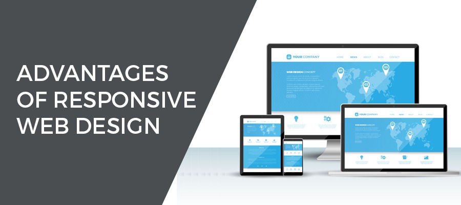
Creating websites that can adapt to the size of the visitor’s viewport is called responsive web design. Content is rendered differently depending on the device or screen size so that visitors have an optimal experience no matter how they access your website. The primary benefit of responsive web design is that sites load at fast speeds without any hindrance, so users don’t need to manually resize anything to view content.
3 Main Components of Responsive Web Design
If you are looking to create your website and desire a responsive web design, any good web development company will tell you there are three core principles that you as a web designer should follow:
1. Fluid Grids
Grid systems that scale based on the user’s screen should be used rather than fixed-width layouts that are always the same visually. Fluid grids make all the elements of the website resize in relation to one another.
2. Media Queries
Fluid grids are great for responsive web design but they only accomplish so much. Media queries allow a website to gather data that determines the size of the screen a visitor is using to access it. Using the collected information, it loads CSS styles that are relevant for that particular screen size.
3. Flexible Images
Resizing images is one of the biggest challenges to responsive web design. The easiest option is to use CSS’s max-width property, this makes the images load in their original size.
Benefits of Responsive Web Design
1. Enhanced User Experience
If users have a hard time navigating your website or find that they have to constantly pinch and zoom to correctly use your website, they will not bother spending too much time on the website. However, if your website responds and scales to the change in screen size, then users will be able to easily access menus, buttons, links or fill out forms. Resulting in a better user experience and more time being spent on your website.
2. Increased Mobile Traffic
In the last quarter of 2017, more than 52% of all global web traffic came from mobile devices. This is more than half of all internet traffic and shows you that responsive web design can’t be overlooked.
3. Easier to Maintain
If you maintain multiple websites for various devices, meaning you have to make changes across all. With a responsive website, you only need to make the change once.
4. Boost for SEO
Marketing is one of the most crucial steps to the success of a business. SEO is one of the best ways of marketing your business and drive traffic to your website. Google favours responsive websites and they appear higher on search engine results.
5. Lower Bounce Rates
Slow, cluttered, and difficult to use websites aren’t likeable to your potential customers. If they find your website is not compatible with their device they will just back out and go to a website of your competitors. Responsive websites reduce bounce rates with quick loading, clear call-to-actions, and easy to use navigation.
6. Improved Conversion Rates
A responsive website increases sales as it reaches a larger, more target audience and ensures they have a smooth user experience.
Today’s customers demand an easy and smooth online shopping experience and responsive web design is the way to deliver. Don’t ignore the importance of responsive web design or you may fall behind your competitors.


